|
|
Post by johnboy on Oct 18, 2007 14:26:00 GMT
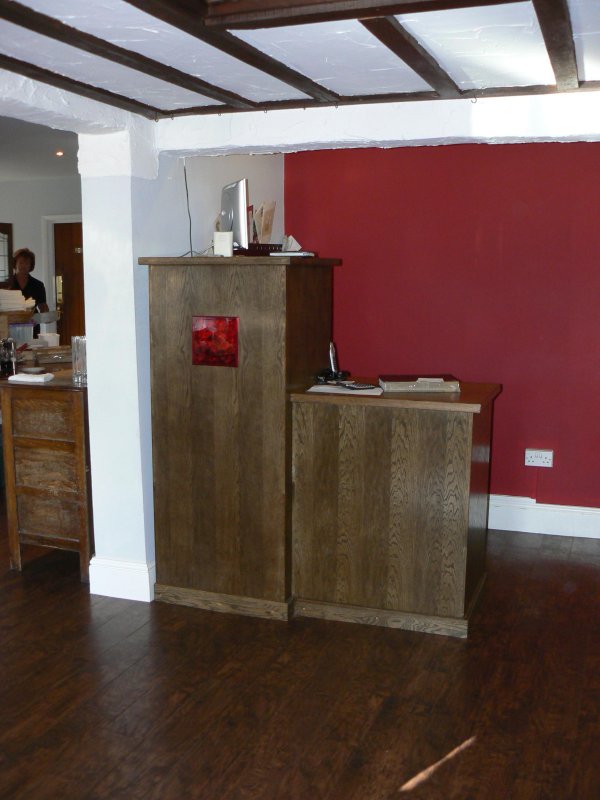
This is the Pub sales counter installed. The stripeyness (is that a word?) is not as bad as it looks with the flash photo. I don't like it much. I don't like oak stained dark like this and the design is too plain for my taste but the designer loves it as do the clients and I have been paid ;D  Any comments, good or bad, welcome. John |
|
|
|
Post by dom on Oct 18, 2007 17:07:18 GMT
Dahling the designer alvays lurves it, she/he gave you the job.
No way they're gonna knock your work.
Not that your work needs knocking.
|
|
|
|
Post by paulchapman on Oct 18, 2007 18:18:27 GMT
Hi John, I think you've done it well but I share your reservations about the designer's input. Must be very frustrating making something that you know could have looked so much better with a bit more thought given to the design - still you got paid, which is the main thing ;D Cheers  Paul |
|